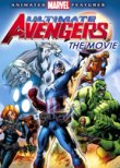
C+
I've just finished watching this movie, and I'll say it was pretty solid, but I was dozing on it a little too much. The action just didn't deliver as I thought it should being an animation based on comic book super heroes. The production quality was grade A as far as aniamtion, and effects, but I would have liked to have seen a little more creativity in set design, and character design.
I was told by a trusted source that Captain America is really cool in this movie, I didn't see what he was talking about at all. His story was pretty good, but I think they could have done a lot more with his combat abilities and the cool shield slinging action that he does in the comics. I realize this is supposed to be kid friendly, but I think they could have juiced it up a little more without warping any minds. It's the same for pretty much all of the other characters. Good character development, not enough showing off of powers and abilities.
The backgrounds were very "Saturday morning cartoons." I think they could have been far more creative with color layout to help them set the mood of each scene. I wanted to see eerie shadows and lighting around the villains, and warm strong colors for the heroes- that sort of thing. Everything was just flat and read the same through every scene.
The character design wasn't especially bad, but I would have loved to see them push expressive design with their characters. These are super heroes. Why not have more fun with straits against curves, and over exagerated proportions? It's too bad Bruce Timm only works exclusively with DC/Warner. Someone like him could have brought a little design magic to the table.
Other than that: the story was solid, the animation was pretty good, and I did have a descent time watching it. Let's hope they put more bite into it for the sequal.


No comments:
Post a Comment